- Product

- Pricing
- Affiliate Program
- Developers
- Resource
 EN
EN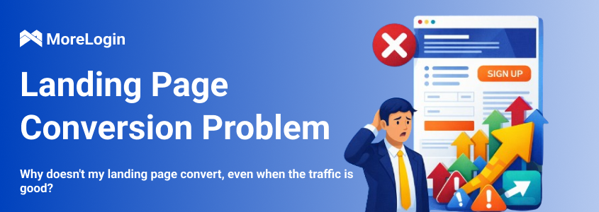
Regular bid optimization, creative refreshes, and constant ad testing won’t deliver real growth if your landing page fails at its core task: turning traffic into leads. In that case, your acquisition budget keeps getting spent while the number of inquiries stays flat.
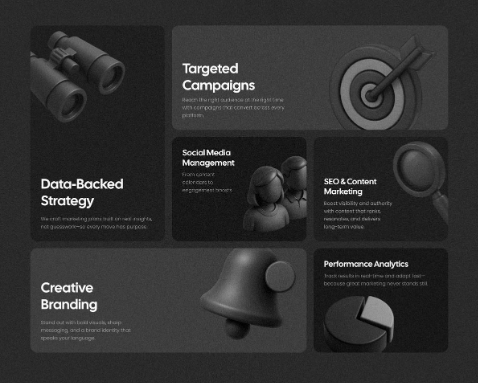
Conversion is not driven by a single element. It’s a system. A landing page converts well only when pop-ups, quizzes, lead forms, FAQs, lead magnets, online chats, messengers, and supporting elements work together as one cohesive ecosystem. What matters most is not the number of tools used, but how logically they are connected and how well they reinforce each other.
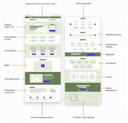
Pop-ups are designed to engage visitors who are about to leave the site. They work best for simple offers such as discounts, instant calculations, checklists, or quick bonuses. A well-timed pop-up can recapture attention and trigger a meaningful response without being intrusive.
Quizzes perform especially well in complex niches such as construction, healthcare, education, and B2B. They help identify user needs, structure requests, and generate high-intent leads, making them far more valuable for sales teams than generic form submissions.
An FAQ block removes the main objections users have: pricing, timelines, guarantees, and reliability concerns. When placed near a lead form, FAQs significantly increase submission rates because users get answers at the exact moment they’re making a decision.
Your offer must be simple and clearly valuable: a cost estimate, product or service catalog, checklist, or solution shortlist. This explains why users should fill out the form and what tangible benefit they’ll receive in return.
These channels are ideal for visitors who aren’t ready to submit a form but want to ask clarifying questions. They help retain interest and reduce pressure on primary conversion forms.
Reviews, case studies, performance metrics, project results, and client logos build trust and strengthen the effectiveness of all other conversion elements on the page.
A landing page must have one primary conversion path that all functionality supports. Secondary elements should never distract users—they should reinforce the main scenario, not compete with it.
Working through tools like MoreLogin helps accurately track user behavior, test multiple variants, synchronize events across sessions, and optimize each element for maximum conversion efficiency—especially when managing multiple accounts or workflows in parallel.
Paid traffic directs users to a page where the central element is a quiz or a short lead form
Nearby blocks include reviews, case studies, and an FAQ to instantly address objections
Visitors who don’t convert see a subtle exit pop-up with an additional offer
On mobile devices, pop-ups are replaced with a messenger button or callback option to preserve a smooth user experience
This setup is simple but consistently delivers higher conversion rates.
To keep a landing page effective without irritating users, moderation is essential.
One pop-up per visit is usually enough. Quizzes should be short—no more than seven questions. Forms can be tested in two variations with different messaging, while FAQs should address only real objections your audience actually has. Overloading a page with triggers reduces conversions. The interface’s goal is to simplify the user’s path, not to pressure them into submitting a form at any cost.
Your conversion toolkit must align with your target audience.
B2C with low to mid pricing: short forms, simple discount pop-ups, social proof, light quizzes, and soft triggers work best
Rational audiences and high-ticket products: quizzes combined with detailed FAQs, case studies, hard numbers, and structured pop-ups perform better
Premium segments: require a different approach—minimal distractions, no aggressive triggers, and a strong focus on personalization, expertise, and high-end visual presentation
A landing page must continue the message users saw in the ad. If your main tool is a quiz, show its first step or hint at the result directly in the ad. If the offer is built around a lead magnet, keep the wording consistent to avoid expectation gaps.
In retargeting campaigns, motivation should be stronger: personalized offers, consultations, or limited availability slots help re-engage users who already know the brand.
Pop-ups, quizzes, forms, and other interface elements are not decorative features—they are functional components of a single conversion system. When these tools work sequentially, reinforce each other, and follow a clear logic, paid traffic turns into real leads naturally. The result is higher conversion rates without increasing advertising spend.
EN