- Product

- Pricing
- Affiliate Program
- Developers
- Resource
 EN
EN
Usually, we create materials based on verified sources, case studies, and industry research to ensure the content is both unique and valuable. However, this time we’re making an exception. The guide you’re about to read was originally written a while ago, but it remains highly relevant for anyone looking to learn how to build a high-converting landing page from scratch.
This information is still in demand and provides a clear, structured approach to building a functional and effective promo page. All you need is a solid pre-lander from a SPY tool, apply the structure from this guide, and adapt it to your offer — or, if you have the time, start completely from zero.
There is no universal, step-by-step template that guarantees high conversion for any product category. The final result always depends on many factors: your target audience, product specifics, seasonality, traffic source, and more. That’s why this guide doesn't present hard rules, but flexible recommendations to help you better understand what makes a landing page actually work.
This content is based on real-world experience in building promo pages for Nutra and eCommerce offers, as well as performance data from affiliate campaigns. It’s especially helpful for promo departments — designers, developers, and copywriters — and also solo affiliates who prefer to build their own creatives and funnels.
Headlines play a crucial role on any landing page. They’re the first thing users see — and often the only thing they read. The goal of your headline is to immediately grab attention by highlighting a problem, a solution, or building trust.
Effective examples might look like:
“150 tons of harvest destroyed because of this…”
“Pharmacies teamed up to block this $3 joint cream”
“Lose 20 kg in just 2 weeks with PBK-20 — no diets or workouts”
“Over 1,700 moms are now happy owners of the Mommy Bag from our store”
Avoid generic phrases like “About our company” or “Our services.” They fail to spark curiosity or drive engagement. Also, be cautious with question-style headlines — a negative answer can reduce the perceived value of the content that follows.
Most users spend just 10–15 seconds on the hero section and even less on the rest. That’s why your headline needs to act like a lighthouse — drawing users deeper into the page. Action words and benefit-driven phrases work best, though there’s no one-size-fits-all formula. Success comes from deeply understanding your product, your audience, and your competition.
All text must be grammatically correct and typo-free — even small errors lower trust. Write in a clear, benefit-focused tone and avoid overly complex sentence structures. Visitors aren’t there to read; they’re there to solve a problem. Your copy should deliver real value quickly and clearly. The content length should be just enough to answer key questions — no fluff, no filler.
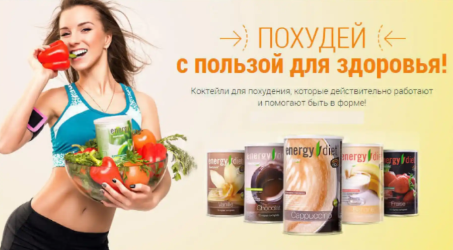
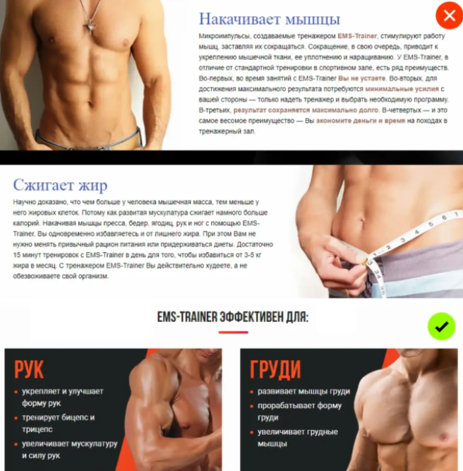
Images can significantly increase conversion when they are high-quality, relevant, and emotionally resonant. Avoid blurry, generic stock photos — they break trust instantly. Show the product in action. Let users visualize the outcome they’ll get.
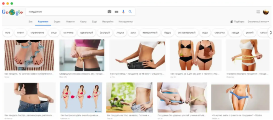
Visuals should align with your target audience and direct attention to important sections. Use lifestyle imagery, subtle directional cues, and eye flow guidance to enhance UX.
Avoid sliders — they rarely hold attention, especially on mobile. Instead, use collages or auto-looping carousels. Videos can boost conversions but are only watched by a small percentage. That’s why your preview image and title need to grab attention. Keep videos under 90 seconds, focused on value and uniqueness. In 2025, it's smart to convert short clips into GIFs and self-host longer ones to avoid bans and speed up loading times.
Break content into digestible sections: 4–5 lines per paragraph, use colored highlights or background blocks to emphasize key messages. Avoid clutter — no more than 4 content elements per screen. Supporting information is okay as long as it doesn't distract.
When describing the product, consider infographics, comparison blocks, and summary bullets (“anchor takeaways”) at the end of each section. These reinforce key ideas and improve retention.
Every element on the page should support a unified message. The perceived value of the content must match the user's time investment. Remember: you’re not just selling a product — you’re selling a solution to a real problem. Design with structure, clarity, and persuasive intent.
The main goal of a landing page is to lead the visitor toward a conversion action. Users go through several psychological stages before they decide to buy or submit a lead: first they notice the offer, then they show interest, then desire is created, followed by action and, finally, post-conversion evaluation.
To maximize conversions, the first three screen blocks must clearly communicate what the product is, why it matters, and why this product is the best choice. The faster a visitor understands the offer, the higher your conversion rate. The remaining sections should focus on building trust, eliminating objections, and reinforcing the offer’s value.
Your unique selling proposition (USP) must be clear, specific, and client-focused. Avoid vague or generic slogans. Instead, focus on how the product solves a problem, creates transformation, or improves quality of life. Use strong verbs and outcome-oriented language. If you promise something bold on the hero screen — you must back it up later on the page.
Your call-to-action (CTA) should stand out visually and emotionally. Orange buttons tend to perform well across niches, while red works great for flash deals. Use rounded corners for a more friendly feel. The CTA text should promise a benefit — not just describe an action. For example: “Get My Discount” or “Start Free Trial” is much more persuasive than “Submit” or “Send.”
Lead capture forms should be easy to find and strategically placed. Typically, they go below the product intro — after the visitor understands the value. Add a quick bullet list of benefits near the form to boost conversion. The fewer fields, the better. Only ask for essentials — and phrase them in a clear, friendly way.
If you're running traffic and testing multiple landing page variants, we recommend using an anti-detect browser like MoreLogin. It helps manage multiple accounts safely, isolate browser sessions, and bypass platform restrictions. This is especially useful for affiliates and performance marketers working with paid traffic and A/B testing. It allows you to scale and test offers more effectively without bans or tracking issues.
Guarantees play a key role in overcoming objections like high price, skepticism, or hesitation. They give users the psychological safety to take action.
An effective guarantee directly addresses risk. For example, someone considering a scratch-removal product may worry it won’t work. A clear “money-back guarantee if not satisfied” makes the decision easier.
Use specific, measurable promises, not vague claims like “we guarantee results.” Instead, say:
“Visible acne reduction within 24 hours”
“Look 10 years younger after your first use”
But don’t just promise — prove it. Add certificates, clinical studies, expert endorsements, or regulatory compliance documents. These turn marketing claims into trusted proof.
Finally, make your guarantee visually prominent. Don’t bury it. It should stand out and become a strong driver toward conversion.
When building a Nutra landing page that converts, there are no small details. Every element matters — from the headline to the lead form. Success depends on structure, persuasive copy, emotional visuals, and a clear, unique value proposition supported by real proof.
Whether you're a designer, media buyer, or solo affiliate, this guide gives you a practical framework to build high-performing promos in the Nutra vertical — faster, smarter, and with more confidence in 2025.
If you’d like me to generate a tailored image or convert this into a short-form video script, just say the word!
EN